How Crash Game Interfaces Are Designed for Players
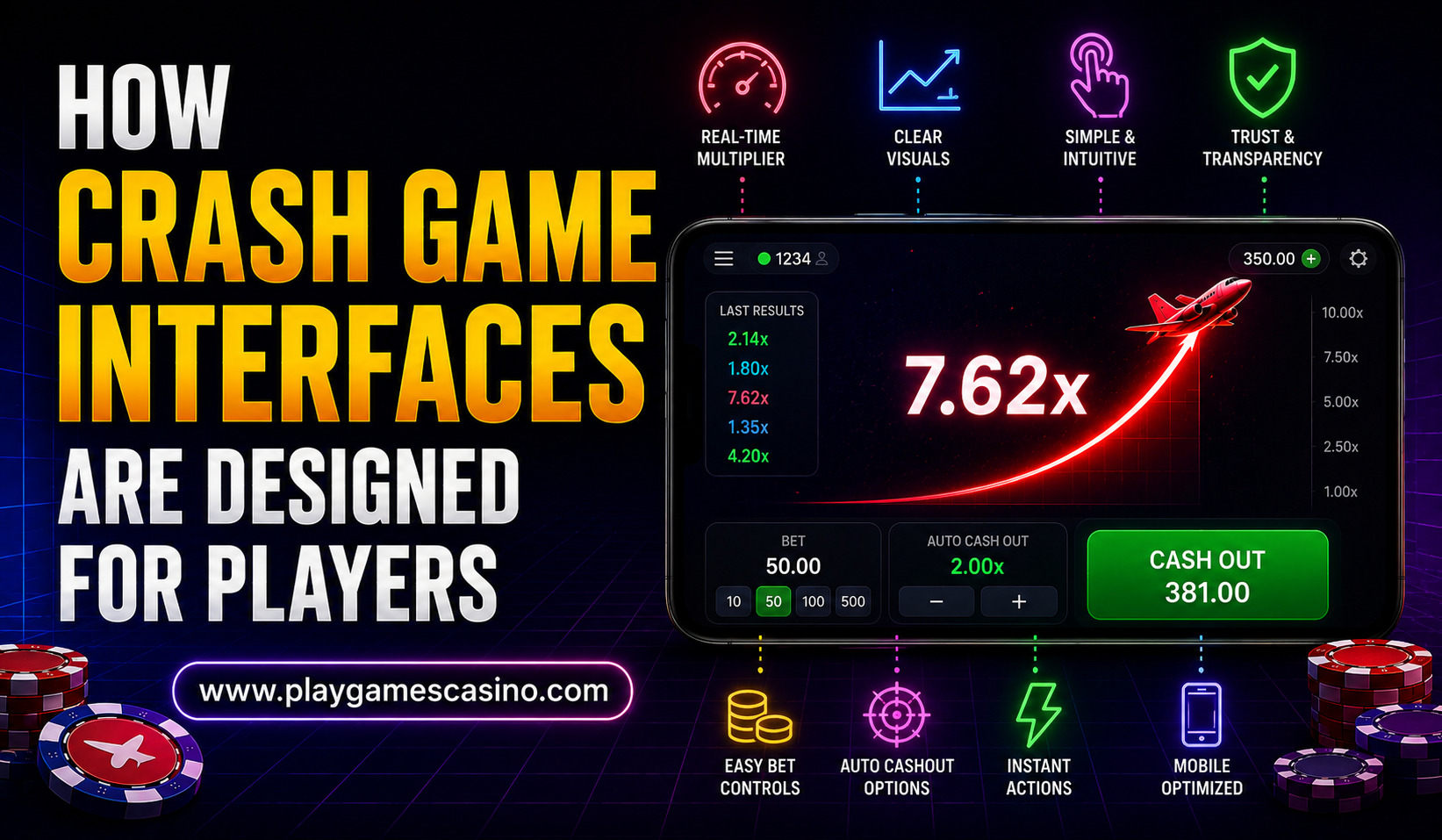
The rise of crash-style online games has brought a different kind of interface design to the gaming industry. Unlike traditional casino games that often rely on cards, reels, or boards, crash games usually place a continuously changing multiplier at the center of the screen. The visual experience is built around watching that multiplier increase and deciding whether to exit before the round ends.
Because the action can develop within seconds, interface design plays an important role in how players understand what is happening. Developers need to present information quickly without making the screen unnecessarily complicated. From the multiplier animation to betting controls, history panels, balance information, and notifications, almost every element is designed around speed and clarity.
The Main Idea Behind Crash Game Interface Design
A crash game interface generally follows a simple visual structure. The central area displays the current round, while controls for placing bets and collecting a potential return are positioned nearby. Supporting information, such as previous results or active players, may appear around the main game area.
The simplicity is intentional. Players should be able to identify the current multiplier and important controls almost immediately. A complicated interface could make it difficult to understand when a round begins, how quickly the multiplier is moving, or whether a particular action has been registered.
This is particularly important on smartphones. Mobile users have less screen space than desktop users, so developers often prioritize the most important information and reduce secondary elements. Buttons need to be large enough to tap comfortably, while text must remain readable across different screen sizes.
The Multiplier Takes Center Stage
The multiplier is usually the most prominent visual element in a crash game. During a round, it may increase from a low starting value and continue upward until the game suddenly ends.
Designers use animation, changing numbers, motion effects, and other visual signals to make this progression easy to follow. The multiplier needs to remain readable even when the rest of the interface contains additional information.
The visual movement also creates a strong sense of progression. Instead of waiting for an outcome to appear at the end of a conventional game, users watch the result develop in real time. This makes the interface more dynamic and requires careful attention to timing and responsiveness.
A well-designed interface does not need excessive decoration to create this effect. Clear typography, sufficient contrast, smooth animation, and an uncluttered central area can communicate the game’s state effectively.
Betting Controls Are Designed for Fast Interaction
Another important part of the interface is the betting section. Players typically need to enter or select a stake before a round begins and may have access to features such as automatic collection settings.
Developers generally separate these controls from the main visual display so that users can understand where to interact without covering the central game area. On desktop screens, the controls may appear below or beside the game. On mobile devices, they are often reorganized into compact panels.
Common interface priorities include:
- Clear bet amount controls
- Easily identifiable action buttons
- Visible account or balance information
- Simple settings for optional automated features
The goal is not simply to make buttons attractive. Their placement, size, labeling, and response feedback all contribute to whether users understand what happened after tapping them.
Mobile Design Has Become a Major Consideration
The growing use of smartphones has changed how online gaming interfaces are developed. A desktop interface cannot simply be reduced to fit a smaller screen. Elements need to be rearranged according to touch-based interaction.
On mobile devices, designers must account for finger placement, screen orientation, changing display sizes, and limited visual space. Important controls are generally kept within easy reach, while less essential information may be hidden behind expandable sections.
Responsive design also allows the same game to function across smartphones, tablets, and computers. Instead of creating completely separate interfaces, developers can use flexible layouts that adjust depending on the available screen dimensions.
Performance is another consideration. Animations and real-time updates should remain smooth without consuming unnecessary processing power or data. A delayed interface can create confusion, particularly when users expect immediate feedback after pressing a button.
Why Visual Hierarchy Matters
Visual hierarchy determines what users notice first. In a crash game, the current multiplier is normally given the highest priority because it represents the central state of the round.
Secondary information is often displayed using smaller text or less prominent positioning. Previous round results, player activity, account details, and additional settings can remain available without competing with the primary game display.
This approach follows a basic design principle: important information should be recognizable before less important information. When too many elements receive equal visual emphasis, the interface can become difficult to understand.
A strong hierarchy can therefore make a relatively complex real-time system appear simple. The user does not necessarily need to understand the technology behind the game; they need to understand what is happening on the screen.
History Panels Help Players Follow Previous Rounds
Many crash game interfaces include a history section showing the results of earlier rounds. These results may be represented by multipliers arranged in a horizontal or vertical sequence.
From a design perspective, the history panel provides context without interfering with the current round. Users can quickly see recent outcomes while the active multiplier remains the dominant element.
However, historical information should be presented carefully. Previous results describe what happened in earlier rounds and do not, by themselves, establish what will happen next. Interface designers therefore need to distinguish historical data from current-game information clearly.
Animation and Feedback Improve Usability
Animation is another major component of crash game interfaces. The multiplier may change continuously, while buttons can visually respond when selected. Loading indicators, status messages, and transition effects can also communicate changes in the game’s state.
Good animation supports understanding rather than simply adding decoration. For example, a button changing appearance after being selected can confirm that the system received the interaction.
At the same time, excessive animation can become distracting. If every part of the screen is moving, it becomes harder to identify important information. Designers therefore have to balance visual excitement with usability.
Desktop and Mobile Interfaces Compared
| Interface Element | Desktop Experience | Mobile Experience |
| Main multiplier | Large central display | Large central display adapted to smaller screen |
| Betting controls | More space for multiple controls | Compact touch-friendly layout |
| Game history | Often visible beside or below the game | May use a smaller scrolling panel |
| Navigation | Multiple sections can remain visible | Often simplified or collapsed |
| Interaction | Mouse and keyboard | Touch-focused controls |
| Animation | More screen space for visual effects | Optimized for performance and battery use |
The table shows why responsive design is important. The underlying game can remain the same while the presentation changes according to the device.
The Role of Color and Typography
Color and typography contribute significantly to interface readability. Designers may use contrasting shades to separate active controls, inactive options, historical results, and important status messages.
Typography needs to remain readable at different resolutions. The multiplier, for example, usually receives a larger type treatment because it is the primary piece of information during the round.
Color should also have a clear purpose. If too many colors are used simultaneously, the interface can lose visual consistency. A restrained design system can make important changes easier to recognize.
Security and Trust Signals in the Interface
Interface design is also connected to user confidence. People expect financial information, account balances, and game status to be displayed accurately.
Visible transaction confirmations, account information, and security-related indicators can contribute to a sense of reliability. However, visual trust signals should not substitute for actual security practices. Behind the interface, platforms need appropriate technical safeguards for accounts, payments, data, and game systems.
The interface is therefore only one part of the overall user experience. A polished design cannot compensate for poor reliability or unclear operating practices.
Conclusion
Crash game interface design combines real-time information, responsive controls, animation, typography, and visual hierarchy into a compact digital experience. The central challenge for developers is to make fast-changing information understandable while ensuring that users can interact with the interface easily.
As mobile gaming continues to expand, responsive layouts and touch-friendly controls will remain important. At the same time, transparency, accessibility, security, and responsible design are becoming increasingly relevant to the overall user experience.
The future of crash game interfaces is therefore unlikely to be defined only by visual effects. The more important direction is creating interfaces that are fast, clear, responsive, and informative across different devices. A successful design can make a complex real-time system feel straightforward without obscuring the information users need to understand what is happening.
Frequently Asked Questions
What is the most important element in a crash game interface?
The current multiplier is generally the central element because it communicates the real-time progression of the round. Betting controls and status information are usually organized around it.
Why are crash game interfaces often visually simple?
The gameplay can change quickly, so excessive visual complexity could make important information harder to identify. Simple layouts help users focus on the current game state and available controls.
How are mobile crash game interfaces different?
Mobile interfaces are designed around smaller screens and touch interaction. Controls are typically larger and layouts are rearranged so essential information remains visible without overcrowding the display.
Does animation affect the usability of a crash game?
It can. Well-designed animation can communicate changes and provide feedback, while excessive animation may distract users. The best interfaces balance visual movement with readability.
Why is game history displayed?
A history panel allows users to view previous round results without interrupting the current game display. It provides historical context, although past results should not be interpreted as guarantees of future outcomes.